In this module I have explored several things this semester, the main focus of course being my Showreel. I have also looked at design and working on some more involved hard surface modelling that follow these designs. This is something that I will be taking forward into my future projects.
Design itself was also the main focus for one of my other modules, and is something I will be focusing on more in the future.
In regards to showreels. I came across this fantastic video on Youtube by artist Gilberto Magno. It takes the showreel Idea and uses it to present and show off a very complex and involved model In an incredibly compelling and original way. It is a technique I want to try and replicate within one of my future projects as-well in showing off a model that I feel deserves it.
Im glad that I undertook this project, as it not only enabled me to apply to MPC and start getting some work shown around. It was also my first time trying to create a professional showreel in order to present my work to employers. I learnt a lot about how to construct a reel as well as different tips and technique for showing off different kinds of model.
I am planning to update the reel soon with some more finished work as well as fixing the CGHub links (as CGHub was shut down). This is another reason I am glad I did this, I now have a framework and a template in place for creating future reels and adding new pieces, so that it will not take anywhere near as long in the future to produce.
The thing I regret most about this though is that the sheer amount of time it took to produce meant that I was unable to focus on certain other works, that will need to be completed in future. Rendering out all the separate elements as they were required as well as putting together each draft took significantly more time than I had originally estimated. However I am glad that I chose to do this now as I was able to get great feedback on its creation from peers, lecturers and on-line communities.
Below is a quick view of the actual FX Compositing tree that was behind the creation of each section of the video.
I am putting these two drafts together as there is very little that changes between them.
These drafts were heavily based on feedback from another lecturer. They have been cut back to include a more focused selection of hard surface work, as well as being timed to fit better with the music.
The still images have also been improved to help add even more context to the models. I tried to show them within the environment that they were intended for using a photo bashing technique within Photoshop.
There is not a lot to say about this version, I have re-done the title card as well as adding an end card. Both of these have links and contact detail on them. I felt it was important to include on the title card as well so that if for some reason the viewer doesn't see the end, they still have contact details.
Another draft, here we have an idea which goes some way to helping solve the issue of dizziness that was plaguing my reels beforehand. The still images that are panned over slowly have been designed to give the viewers eye a rest between turntables. They also serve to show the models off in some form of context. As I mentioned previously, the reel is about selling yourself and showing off the models the best way you can. I felt that these images would help add an extra layer of that, as well as providing something different and interesting compared to the turntables.
In this reel, we also have the final piece of music I wished to use, a track by Kirill Pokrovsky that he created for Divinity: Dragon Commander. I was able to obtain the composers permission to use this piece of music within my show reel. I feel that it fits very well. I extended the track using audacity to loop the main melody so that it could be as long as I needed it. The percussive nature and strong beat of this track as well as the memorable melody provide the sense of rhythm that I was looking for to help carry viewers through my show reel.
Another track I had thought about using was this, however the track itself is a bit too intense and too fast for the reel. Timing it correctly and having the right flow would have meant speeding up the reel. This would only have compounded the issue of dizziness that I was on my way to combating.
The labels have been included here as well, as we are getting closed to a final presentable version.
This version of the reel also required some more work. For a start it is still too long and I needed to find some way to cut it down. I was also unhappy with several of the still, panned images. So this was something I needed to correct before It was presentable.
Here we can see that I have begin to implement a lot of the ideas brought to my attention by feedback given on the previous iterations. I also began to look at selecting appropriate music for the reel. Looking through a lot of breakdowns and reels I knew I wanted to select something that was upbeat and added a sense of rhythm to my show reel.
The piece of music I chose in this draft was not intended to be the final piece. There was a few pieces of music I had in mind that I wanted to use for the final, however I had to go about obtaining permission to use them.
As a place holder piece however the track isn't too bad, although the lack of a percussive instrument within it means that it isn't adding much of a sense of rhythm to the video. Which is important as I wanted to use that to help carry a viewer through the video.
Layout wise I've also nailed down how to present the different types of model. For example I reckoned that for the organics models It wasn't too important to see the hi-polygon wire frame or model, and adding it would just take up much more space within the reel and make it last too long.
The presentation of the models has been improved as well, with most of them being posed in some sort of way and rendered out within V-Ray. As this is the point of the show reel, to show off the models the best that I can, and so, again based on feedback from a lecturer. I set about posing my models to make them more interesting.
Within this we can also see the indication of the title cards that will provide the links and contact information for my other folio websites.
In future drafts, I still needed to address the issue of people becoming dizzy when viewing it because of the constant spinning. There are also a few wire frames that do not stand out well just because of the way they are coloured, so this needed addressed as well.
And the background has also been changed to not be as similar to Maya, but a nice neutral shade that should fit reasonably well with all the models displayed on it.
This is a quick demonstration I through together of how I felt like I could work around the issue of it jumping between all the different maps, and cutting too quickly for the eye to rest on one image.
This goes some-way to solving this problem. However there are still issues with it as pointed out by one of my lecturers. For a start there is no priority given to any of the image so the eye does not know where to look. Secondly, it does not solve the dizziness issue.
Other issues include the fact that the background is too similar to Maya's. Which would put a lot of people off, as they would spend a lot of their days staring at those colours regardless.
However I was very happy with the idea of having the different models all on the one page and this is the way that I chose to present my creations from here on. As I felt it provided a good looking, effective way to show the breakdown of images.
In deciding how to present my models I looked at other showreels and breakdowns.
These are two of the break-downs that are what initially inspired some of the choices I made in presenting my models. Such as showing the texture maps on the model as opposed to as a flat texture (Which can be seen on my folio site).
It also gave me the idea of layering the wire frames over the top of the actual model rather than having it as a separate turntable like this. Layering them over was just a matter of simple compositing.
I decided I was going to apply for an intern ship position at MPC. So I had to create a professional quality show-reel from the existing work I had. So a large chunk of my work this semester was spent rendering, compositing and refining a final and presentable show-reel. Which is something I had never done before and so it was a good learning experience.
Given the size of the rendering jobs required to create this, as-well as the potential opportunity should it be successful. It quickly became my priority. Especially since I am approaching the end of my University career and I feel like it is important to be able to present myself professionally.
Anyway, here is the link to an initial draft/ idea for the reel.
There is a lot of problems with this as I had posted it around various groups to get peoples opinion on it and several points were raised.
- Cutting between the different maps means there isn't enough time to focus on one long enough to pick out details. It gives the eye no time to rest on an image before it is changed.
- This problem is compounded by the fact that the pieces are spinning too fast which gives too little time to focus on them. This can be solved by cutting out unnecessary images.
-The spinning and the speed of it made people feel dizzy. Not a good effect to have when you are trying to present yourself.
-The renders do not present the models in the best way.
As background characters for the scene I had been wanting to do something along more fantasy lines for a while now. So the idea is that this Mech has somehow come up against this band of knights and they've gotten into a fight. So for the knights I wanted to create a set of modular pieces that could be used to make several different types of knight to fill the background. I also wanted to try and keep them reasonably authentic, and also keeping in mind that these are not hero characters, they will be in the background so spending a lot of time on them is a waste.
Anyway I have included some of my reference imagery.
In the end I decided on three basic types of helm to use as a starting point. The Bascinet
The Sallet
The Frog Mouthed
The models for these are pictured below.
From there it was just a case of building up a set of modular pieces for the knights, while keeping my reference imagery in mind.
Pilot! The next step was to create a pilot for this walker. Now for this model I did indeed draw out a very rough concept, just to give me a starting point. Drawing inspiration from existing designs aswell I wanted to create something that looked like a pilot suit rather than just armour or like it was designed solely for combat.
I have included a selection of my reference/inspiration material.
Pictured below is the very rough design I painted in Photoshop. It was enough to get started.
Below is a very quick rough basemesh I sculpted in ZBrush, just to give me something to build around. It isn't great but it did the job.
Here are the first two images of the helmet being modelled. As you can see I tried to stick roughly to the concept but I altered the design a lot where I felt that it needed it. Overall I think that it is better off for it.
The chest piece was very important for me to get right. I really liked the design I had done for it in the concept so the challenge was to realize that fully in 3D, the blue and yellow very quickly became a kind of padded under-suit. As I wanted to keep it clear this was not a combat design there is very little in the way of actual armour plating incorporated within it.
Here we are showing the almost finished model. However I was not happy with the lower legs, and these would be something I went back to alter.
Here is the final hi poly model. After tweaking the lower leg and boot so that it fits in with the design better. I think I succeeded in creating a character that looks like she isn't primarily built for combat. I did however decide to give her a pistol in order to defend herself. The model of which is pictured below the character.
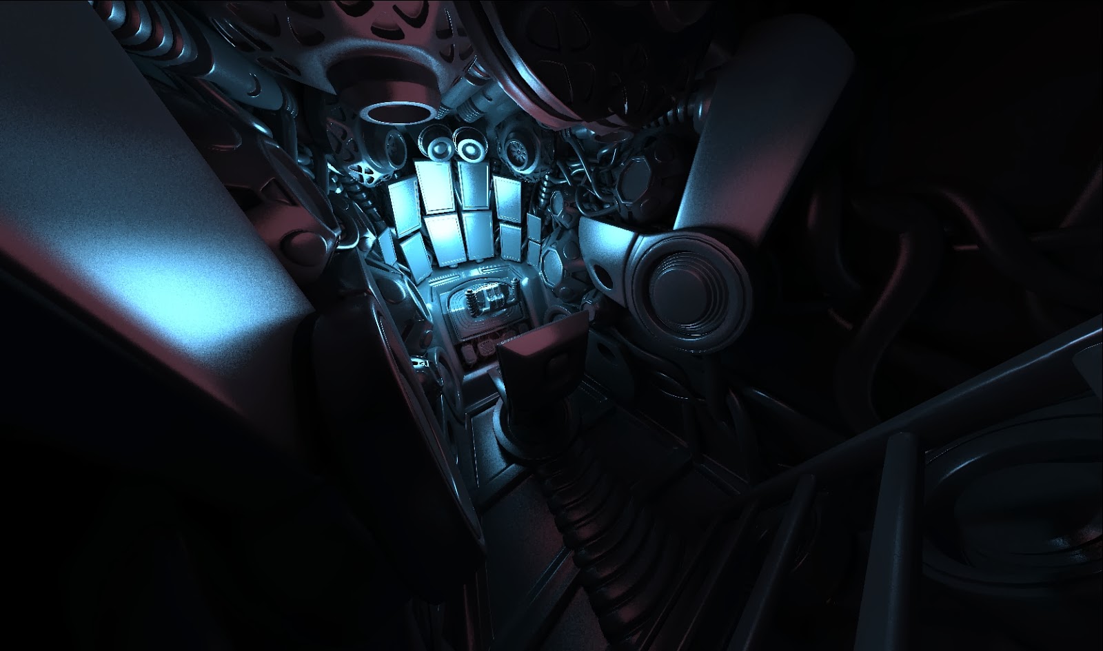
Cockpit! As I said this began as a technical exercise, and so I wanted to just make as crazily cool a model as I could. This involved the modelling of a complete cockpit.
This first image is merely a rough-out of the initial concept for the cockpit. After creating this it became apparent that it could use a better sense of design and a bit more complexity in it aswell.
The first step in achieving this was the creation of some extra controls, mainly joysticks! Inspired by the cockpits in Mechwarrior Online, I felt these controls would help add a degree of authenticity and complexity to the cockpit. Pictured here you can see me using the stock "XSI Man Armoured" model to make sure everything is scaled properly.
Another shot taken of the cockpit from a different view, you can sort of see in this shot the way I changed the view-screens so they looked more futuristic. You can also see the access ladder that you have to climb down to get into the cockpit.
Here we have the pilots view. I positioned a camera in the pilots eyes so that when I switched to it, it would show me exactly what the pilot would see and I could look around the cockpit from his point of view.
Here we have the completed cockpit. I changed the lighting as well and yet again changing the view-screens to make them look neater. I also added a few touches such as cup-holders and a periscope like device positioned above the wheel.
After this I began to build the walker, as I said this initially began as a technical exercise, so I did not do any concept work before beginning modelling as I wasn't sure id be using this in my project at this point.
These were just my initial rough blockouts of the design, just to get a feel for the basic shapes and forms.
Trying to keep the function of the mech very much in mind, how it would move and what each piece was for. Although this would get clearer and clearer as I continued modelling.
In this picture a lot of the functionality of the lower legs has been defined, along with a lot of its basic design elements such as the armour plating. One area I was never happy with at this stage was how the middle leg connected to the lower leg, this is something I would have to fix.
This stage was me just experimenting with the cockpit, as I had had a idea for how the viewscreens within it would work. Drawing inspiration from the Gungnir helmet in Halo (pictured) the idea was that the cockpit itself would have no window. Instead it would have a series of cameras that would feed images to the viewscreens within the mech itself. A bit like how a reversing camera on a car works. It feeds an image to the center console.
This is an important stage, the sides of the main body were changed. They were changed to allow the legs more room to move and so they didnt clip into anything. They were also moved to give the walker a more distinctive/menacing silhouette.
Another important step. A lot of the forms and indeed the details have been defined. However, keeping in mind this is designed for combat I went ahead and added some weaponry to it, two miniguns and two rocket pods. The lower leg design was still annoying me at this point. So that was the next thing I had to tackle.
These are the redesigned (lower) legs. I feel like this is a far better design overall as it looks a lot more functional than the previous one and it also looks less likely to collapse under strain. A few details were also added like the exhaust ports.
Another thing to be reworked was the weaponry. I realised the chainguns as they stood wouldnt be very effective, as they were in a fixed position. So I quickly modelled a system where the walker had two main chainguns pointing forward. And then two smaller ones that could be swivelled around to point wherever they are needed.
MIRV. Another wee thing I wanted to add. A final punch for this walker. An idea I had while watching this particular youtube video. A Multiple Independently Target-able Re-entry vehicle, or MIRV. The idea being that the mech can punch well above its weight if it needs to.
Well here is something that began as a technical exercise, but has now become a major part of my project. I wanted to create a mech along the lines of those seen in the Battletech universe. While also drawing influence from some of my favourite artists such as Vitaly Bulgarov and Ben Mauro. These are some of my reference/inspiration images.


.jpg)


.jpg)


